Best N64 Video Game Box Arts: The Ultimate Ranking
This post may contain affiliate links. If you buy something we may get a small commission at no extra cost to you. (Learn more).
Box art is on its way out.
With the advent of digital releases, frequent updates, and ample storage on our always-online consoles, putting games in boxes starts to seem like an unnecessary waste of plastic.
Games will always have promotional art – but the box format won’t last forever.
And things were different when the Nintendo 64 first came out in 1996.
Publishers needed their games to pop on store shelves & attract potential customers, usually with bright colors and exciting scenes that could sell players on the experience.
The N64 was my very first console (probably like many of you).
It taught me what games were all about and instilled an intense love for shiny boxes containing a boarding pass to my wildest dreams.,
So let’s take a look at some of the best and most iconic box arts of Nintendo’s first 3D console.
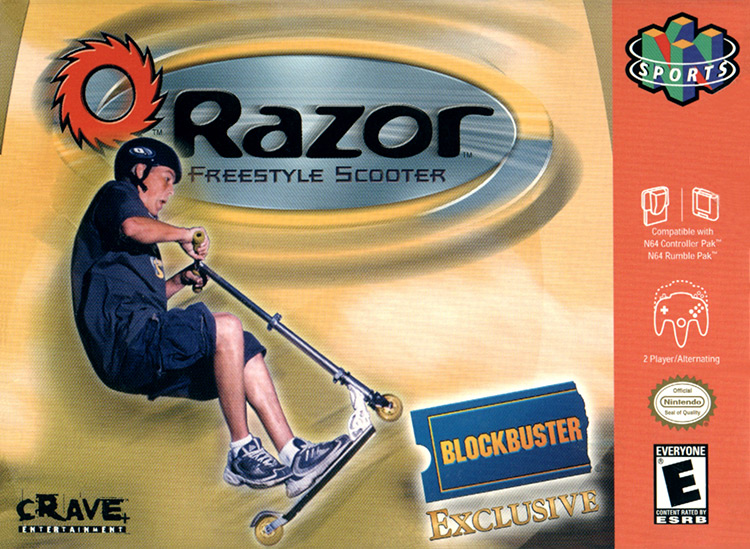
15. Razor Freestyle Scooter (2000)
I’d like to start our list by remembering a cover art that’s so bad, it’s actually memorable.
Shaba Games and Titanium Studios developed Razor Freestyle Scooter for the N64 to cash in on the rising popularity of scooters in the early 2000s.
This box art is so lifeless; it’s actually hilarious.
Razor’s corporate logo and the big “Blockbuster Exclusive” sticker take up most of the available space – that, and a scared kid seemingly about to fall from his scooter.
I guess this was so Razor could sell more safety equipment.
You see that kid’s face? That’s the face of someone who’s not wearing Razor-branded knee or elbow pads!
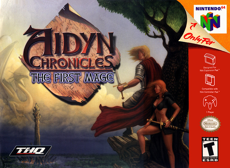
14. Aidyn Chronicles: The First Mage (2001)
Developed by H2O and published by THQ, Aidyn Chronicles was an ambitious 3D RPG adventure where you explore the mundane and spirit planes to find your magical True Name.
The cover sells you an epic adventure with colossal dragons, ominous-looking towers, and female warriors who’ve chosen to wear no armor to stay quick and agile.
And the thing is, the actual gameplay is nothing like that.
The game certainly features a lengthy journey.
But calling it “epic” would be an overstatement.
I’m sure this fantasy adventure could capture your imagination – but the clunky controls would rip you right back out into reality.
Never judge a game by its cover?
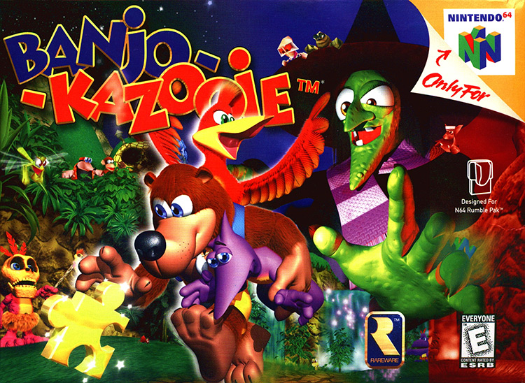
13. Banjo-Kazooie (1998)
Banjo-Kazooie was one of the best games on the N64.
The developers over at Rare really outdid themselves – and they didn’t need established characters like Donkey Kong to advertise their game.
I love this box art because Rare included almost every character and gameplay element on the cover.
Banjo carries a Jinjo and runs away from Grunty (and toward a golden puzzle piece), Kazooie makes fun of her, and Mumbo Jumbo seems to be trying to tell you the witch is looming over the horizon – as if Banjo didn’t already know!
It’s a bit too cluttered for modern standards… but as a kid, it just made me want to find out what all of these things were.
I bought the game, so this box art definitely did its job.
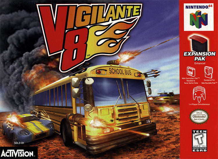
12. Vigilante 8 (1998)
I never played Vigilante 8 as a kid.
But looking at this cover art, I can tell I missed out.
Driving safe? Pfft. That’s for chumps who drive real cars.
This vehicular combat game was all about chaos and destruction – and the cover leaves no doubt about that.
Other than the surprisingly cool logo, the cover features a weaponized school bus being sideswiped by a Shelby Cobra-looking sports car as they both fire their machine guns at whatever lies ahead.
It really captures the essence of a vehicular combat match: circumstantial allies, trading paint, and danger on all sides as you move from one explosion to the next.
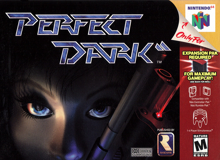
11. Perfect Dark (2000)
While some people find the close-up of Joanna Dark’s face a bit boring or unrefined, I think it achieved what box art needed to at the time.
The bright characters spelling “Perfect Dark” really popped out at a distance. You’d see it the moment you walked into Blockbuster or wherever you got your N64 games – and once you got closer, the alien reflected on Joanna’s eye would pique your curiosity.
In a funny twist of fate, the Japanese cover of the game does the complete opposite.
Instead of showcasing Joanna’s face along with the gun, it pictures a woman in a short dress leaning over a sofa with a gun in hand, and a sniper rifle close by – but they don’t show her face at all!
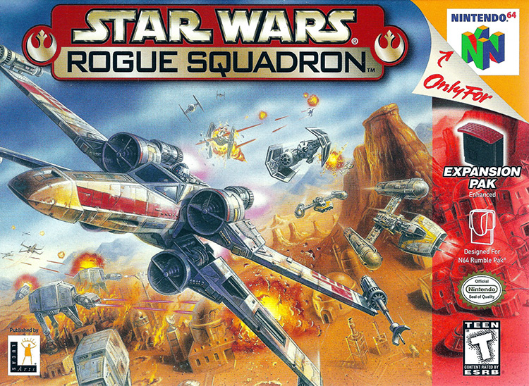
10. Star Wars Rogue Squadron (1998)
The Star Wars Rogue Squadron cover does one thing really well:
It sells you the experience without showing you the graphics.
Other N64 box covers frequently feature 3D rendered characters of much higher quality than their game counterparts, mostly to advertise the game’s 3D nature without relying on the N64 not-so-photogenic graphics.
Instead, Star Wars Rogue Squadron goes with gorgeous detailed hand-drawn art you’d want to hang on your wall.
The cover advertises high-speed dogfights featuring iconic Star Wars spaceships like the X-Wing and the TIE Bomber, among many others.
This was enough to get any SW fan’s mouth watering – and would attract many curious kids too.
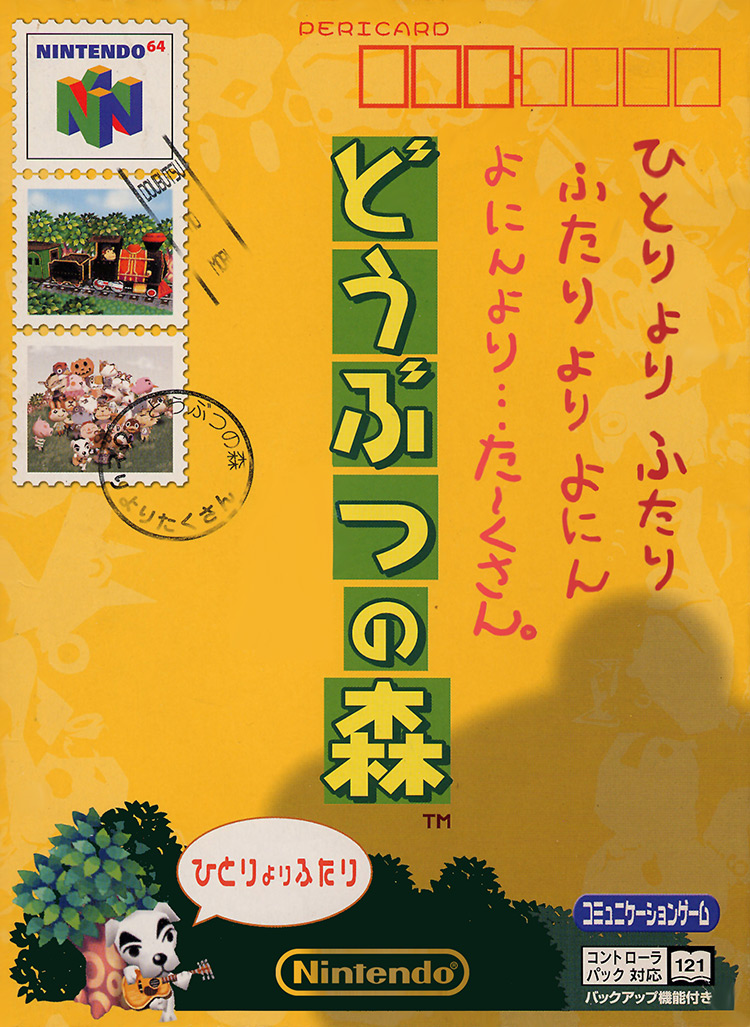
9. Animal Crossing (JP) (2001)
Next up, we’ve got box art that shouldn’t even exist – at least, that’s what North American fans of Animal Crossing might be thinking right now.
You may not know this, but Animal Crossing was originally released for the N64 under the title “Doubutsu no Mori,” which translates to “Animal Forest”.
Its design is nothing special.
But it features bright colors, and even shows us a glimpse of K.K. on the bottom left corner.
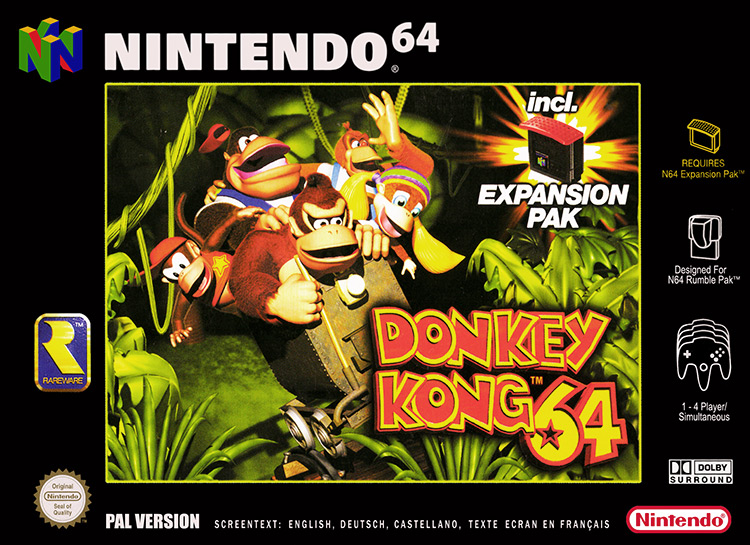
8. Donkey Kong 64 (PAL) (1999)
Much like other Rare titles (including Banjo-Kazooie), the cover for Donkey Kong 64 places the game’s main characters front and center.
You can clearly see the DK Crew of Donkey Kong, Diddy Kong, Tiny Kong, Chunky Kong, and Lanky Kong, all being chased by King K. Rool in the North American cover.
It shows you every relevant character and establishes the conflict before you even start the game.
But for this ranking I went with the European cover art, because they blocked King K. Rool with the required Expansion Pak label.
I was really young when I first played DK64 and saw the Game Over screen way too many times.
I was terrified of K. Rool, and I support disrespecting him in any way.
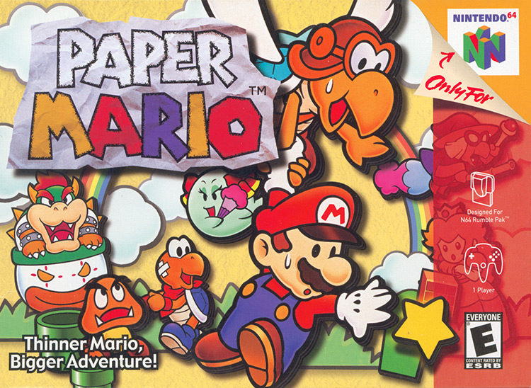
7. Paper Mario (2000)
Paper Mario is a gorgeous game with graphics that mimic the look and feel of paper and cardboard cut-outs – and its cover lets you know right away.
Every character on the cover casts a shadow over the background, much like a hovering paper cut-out would.
The game’s title looks like someone crumpled it up, then straightened it out again.
It’s wrinkly and full of creases that give it some texture and drive home the whole “arts & crafts” feel.
I also can’t help but find the game’s motto hilarious:
“Thinner Mario, Bigger Adventure!”
What about thicc-er Mario? Does he get smol-er adventures?
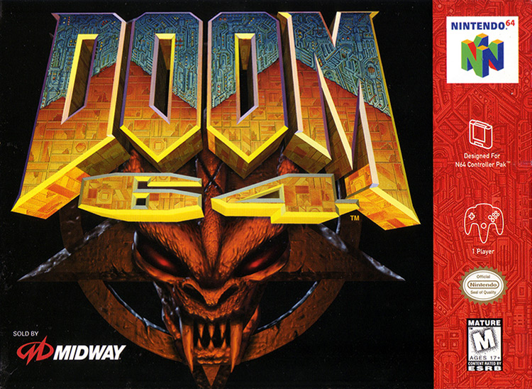
6. Doom 64 (1997)
The cover art for Doom 64 can be described in just one word:
Badass.
At least, it was the most badass cover you could find on the Nintendo 64.
It shows Doom’s iconic logo resting on top of the Demon Artifact – a demonic face on an upside-down pentagram.
Almost everyone knew what Doom was all about by that point in history. So making the game’s logo noticeable from a mile away was a definite priority.
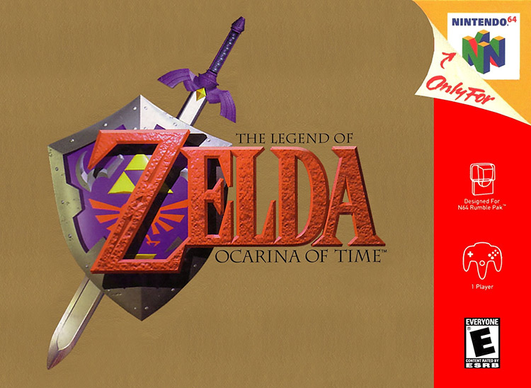
5. The Legend of Zelda: Ocarina of Time (1998)
The cover art for Link’s first 3D adventure has become a symbol of the N64, and of early 3D gaming in general.
Nintendo went with the game’s now-iconic logo resting over a luxurious golden background for the North American cover art.
Link’s Hylian Shield and Master Sword look gorgeous here, and they give us a glimpse of what the game is all about.
I’ll admit that the red strip and “Only for N64” label takes a bit away from the simple grandiosity of this box art – but it’s undeniably memorable, and one of my first memories of engaging with graphic design.
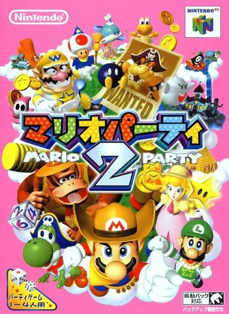
4. Mario Party 2 (JP) (1999)
The Mario Party franchise was one of the most important developments of the Nintendo 64 era.
So of course I had to include one of its colorful & dynamic box arts.
I initially went with the North American version of the MP2 cover, but I bumped into the Japanese version doing some research, and I had to share it with you guys.
Like the NA box art, this one features many Marioverse celebrities like DK, Wario, Peach, Luigi, and Mario, all in different costumes looking hyped up and ready to go.
What sets them apart (and ultimately makes the Japanese version better) is the bright pink background.
It really makes the artwork pop out.
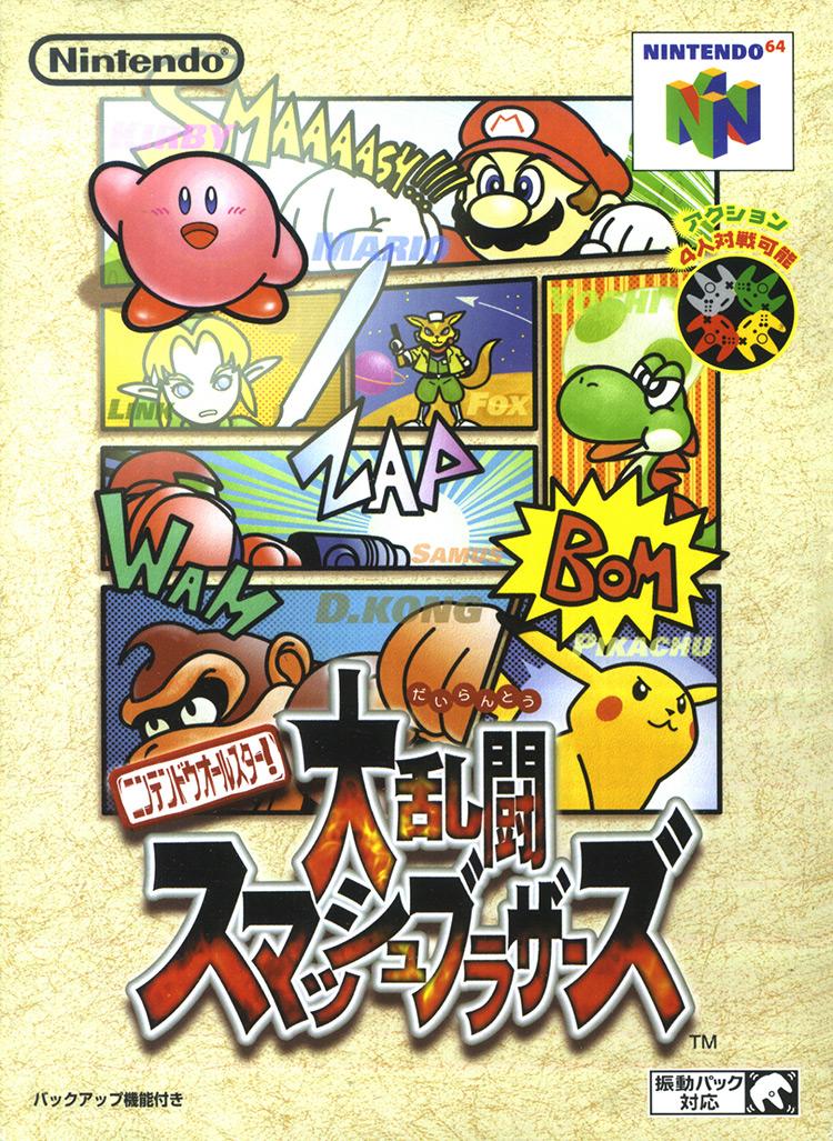
3. Super Smash Bros. (JP) (1999)
Yet another example of Japan getting all the nice things is their box cover for Super Smash Bros. – the original one for N64.
The Japanese cover art shows manga panels of the game’s eight base characters and some of their most iconic attacks, complete with written sound effects and plenty of dynamism.
The only exception is Kirby, who’s just sort of standing there waving.
This probably has something to do with Kirby being so damn popular in Japan.
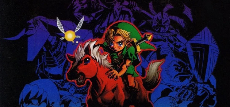
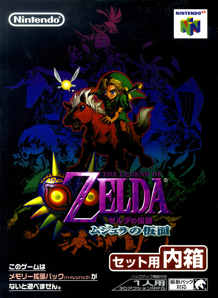
2. The Legend of Zelda: Majora’s Mask (JP) (2000)
Much like its predecessor OoT, the Majora’s Mask’s North American box art keeps things simple.
It shows us the game’s awesome logo with a multicolored background that evokes the idea of moving through a portal, much like Link does at the beginning of the game.
While the NA box is cool, it doesn’t hold a candle to the Japanese cover, which replaces the multicolored background with a scene of Link riding his trusty horse, while the new fairy Tatl flutters nearby.
Dark purple, black, and blue figures tower behind Link, including bosses, allies, and some of Link’s alternate forms.
Then at the very top, the sinister Skull Kid sports the cursed mask.
It’s pretty dark – but so is the game!
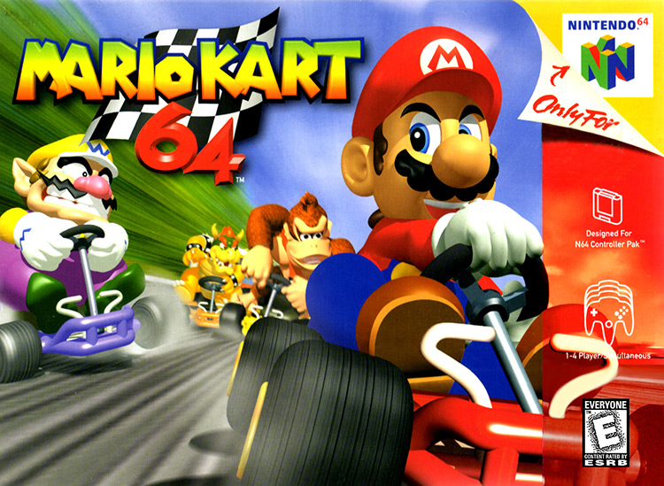
1. Mario Kart 64 (1996)
Mario Kart 64 is one of the best games ever made.
It was undoubtedly the one I played the most on my Nintendo 64. And its cover is something I’ll never forget.
It’s based on the same image as the title screen, which shows some of our favorite characters engaged in a fierce kart race, except the cover is missing Peach and Toad.
While that decision probably had more to do with giving the red strip and “Only for N64” peel-away label space, it also changes the scene’s tone.
Rather than simple competition, Wario, DK, and Bowser seem to just aggressively pursue our Italian hero.
It perfectly captures the feeling of being in first place and feeling predatory vibes from every red shell-carrying competitor behind you – which is what Mario Kart is all about.
Nelson Chitty is a Venezuelan expat living in Argentina. He’s a writer and translator passionate about history and foreign cultures. His ideal weekend is spent between leisurely playing games of Civilization VI and looking for the next seinen anime to marathon.

")


")
