The Best Box Arts From All PS4 Games (Ranked)
This post may contain affiliate links. If you buy something we may get a small commission at no extra cost to you. (Learn more).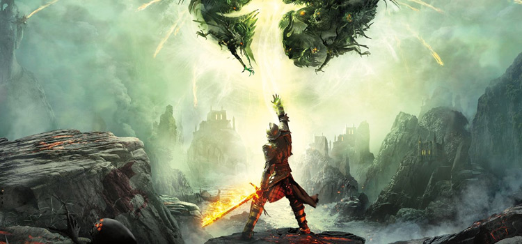
With the ever-increasing popularity of digital media over physical releases, the PS4 might be one of the last few consoles to support physical media.
Box art can be the deciding factor that draws you to a game, and you’ll remember the good times spent playing whenever you see it.
Whether they’re beautiful, exciting, or intriguing, the artwork used to promote our favorite games is a core aspect of the experience.
As the PS4 nears the end of its lifetime and the PS5 takes its place in the homes of Sony fans everywhere, it’s a great time to look back at some of the best box art of the PS4 generation.
15. Marvel’s Spider-Man (2018)
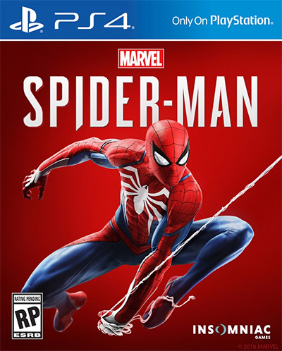
The friendly neighborhood superhero’s eponymous PS4 adventure is one of the best open-world experiences anyone could ask for.
It captures the essence of being the Spider-Man perfectly, much like its cover art.
Some think it’s a bit too simple, but simple is best when it comes to Spider-Man. His default costume for the game is cool enough to be the only focal point on the cover.
It’s dynamic, and it looks fantastic.
What’s not to like?
14. Until Dawn (2015)
Supermassive Games’ interactive horror drama Until Dawn was a surprise hit back in 2015.
Its multilinear storytelling was fast-paced and exciting, and the butterfly effect mechanic made for some fun multiplayer if you let different people control each character.
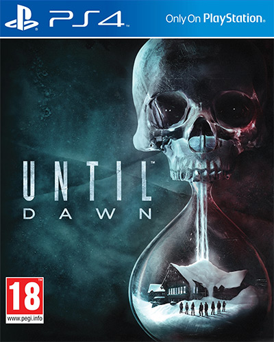
I like how Until Dawn’s somber box art tells you everything you need to know about the game in a single image.
The skull atop the hourglass lets you know time is ticking and death looms nearby, slowly getting closer to our eight protagonists, who we can see in the bottom of the glass standing in the snow in front of a cabin.
13. God of War (Day One Edition) (2018)
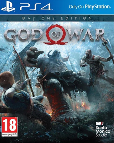
The primary cover art for Santa Monica’s God of War is pretty good – it shows us that Kratos has turned over a new leaf and is now on a boat with his son, probably teaching him how to fish or something.
That said, there’s always room for improvement – and the Day One Edition’s cover shows us what that may look like.
It shows our heroes in action, fighting a fierce troll several times their size.
It’s incredibly dynamic and transmits the feeling of playing the game rather than just showing us the setting.
12. Batman: Arkham Knight (2015)
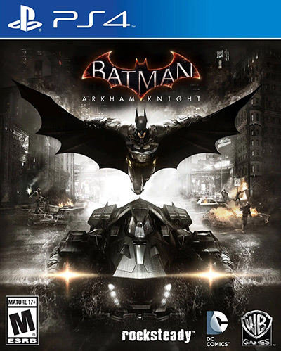
Another dynamic cover that shows us what playing the game will be like belongs to the last Arkham series title on PS4 – Batman: Arkham Knight.
We see Batman gliding down over the new-and-reloaded Batmobile, which he’s probably about to board. Flying around and driving that car around Gotham are two things you’ll be doing a lot in Arkham Knight, so WB gets points for honesty.
In addition, the cover is very symmetrical.
And like we can see in many artistic pieces, symmetry tends to make things beautiful.
In the case of this cover, it totally works.
11. Bioshock: The Collection (2016)
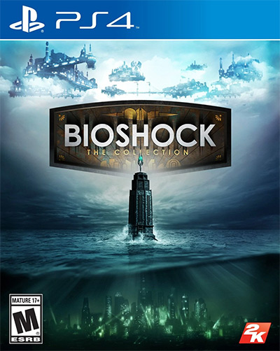
Another game that uses symmetry for dramatic effect is Bioshock: The Collection – a three-in-one bomb of a game featuring all available Bioshock content to date.
This is made evident by the cover, which centers on a mysterious lighthouse in the middle of the ocean. Beneath the waves, the advanced city of Rapture shines an eerie light.
Above the clouds, faint glimpses of the colossal floating wards of Columbia peek through.
While very different in content and aesthetics, Bioshock 1, 2, and Infinite tell the same story.
There’s always a lighthouse, there’s always a man, and there’s always a city.
10. Doom (Reverse Cover) (2016)
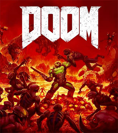
The default box art for Bethesda’s 2016 DOOM reboot was disappointing, to say the least.
The Doomslayer may be epic, but a close-up picture of a space marine facing the viewer was so trite, it became an instant meme.
To appease fans, Bethesda launched a poll to determine what the reversible cover art would be – and this was the winner.
This captures the essence of DOOM, showing us how scores of demons charge head-first into their death at the hands of the Doomslayer.
9. Borderlands 3 (2019)
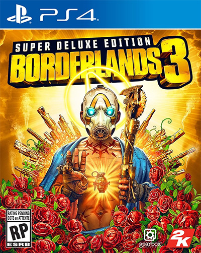
Borderlands 3 was one of the most awaited releases during the PS4’s lifetime.
And its cover feels as if it’s telling players, “Hey, chill out, I’m already here.”
It shows the traditional Pandora-dwelling Psycho in a pose reminiscent of Jesus in Christian religious art.
He puts his hand up as if to say, “be calm, I am here,” which is awfully appropriate given the hype around this game before release.
Something that makes this cover art just a little bit more special than the rest is the hidden SHIFT code present on the barrels of the golden guns in the background, which was part of Gearbox’s marketing campaign.
8. FarCry 5 (2018)

Borderlands 3 is not the only game with box art inspired by Christian artwork.
In the case of FarCry 5, it’s Leonardo da Vinci’s “The Last Supper”.
Joseph Seed takes the place of Jesus, as his siblings and followers gather around him like his 12 Apostles.
In the background, the verdant Hope County paints an idyllic picture – but in the foreground, a tied-up prisoner and a pile of guns remind us of the brutality of this doomsday cult.
The guns, the religious imagery, and the American flag right in the middle do a great job of summing up the themes of the game’s narrative.
It looks sensational – perhaps even divine.
7. Persona 5 (Steelbook Launch Edition) (2016)
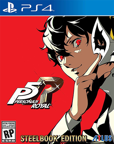
Everything about Persona 5 is stylish, from the character design to the user interface – and the cover art is no exception.
Still, if you want to see something that’ll force you to rethink the meaning of “cool,” take a look at the art on the steelbook case included with Persona 5’s Launch Edition.
Despite being a still image, the angles and shadowing give it an almost cinematic appeal.
You can practically hear “Life Will Change” from the OST playing in the background whenever you see this.
6. Metal Gear Solid V: The Phantom Pain (2015)
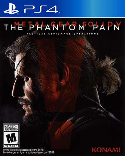
Speaking of pictures that you can hear…
Tell me if you don’t hear Donna Burke going “wohooah” whenever you see this game cover!
The box art for Hideo Kojima’s final Metal Gear Solid brings back the intense emotions felt while playing through this masterpiece.
The quiet determination in Venom Snake’s eyes, the shrapnel horn peeking through his hair, and the lifelike detail of his scarred skin – it’s perfectly representative of the character and how deeply you get to know them throughout the game.
Plus, both the title logo and the V-shaped exclamation mark are marvels of graphic design.
5. NieR Replicant ver. 1.22474487139 (JP) (2021)
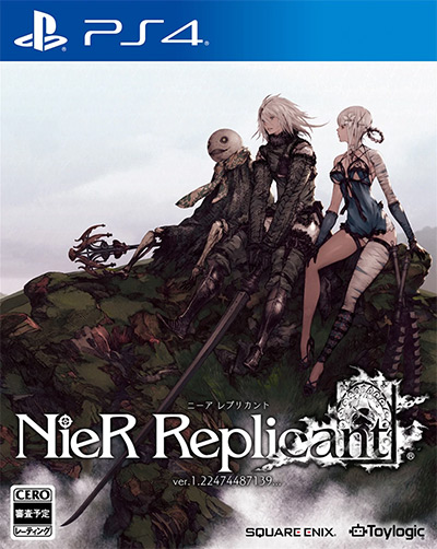
We were all pretty disappointed at the underwhelming 3D-rendered cover art Square Enix decided to plaster on NieR Replicant’s “updated” international release.
I mean, what was wrong with the Japanese one?
Japanese covers might have been a little too delicate for international markets back in the 00s.
But we’re well past those days, people!
Attack on Titan is mainstream. Genshin Impact is a thing.
People can handle a little 2D art on their game boxes.
Fortunately, the Japanese artwork was still included as the reversible cover. So just flip that piece of glossy paper around, and you’ll have a much prettier game to display in your collection.
4. NieR: Automata (JP) (2017)
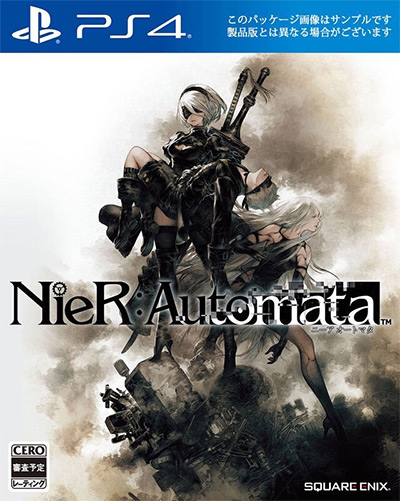
The exact same thing happened with NieR Automata back in 2017, though that made more sense.
People who buy the Replicant “update” will mostly be returning fans, while Automata still had to capture a new audience – which an action-packed 3D combat scene might achieve better than 2D artwork.
Luckily for us, Western fans, the Game of the YoRHa Edition was eventually released bearing the original box artwork by Akihiko Yoshida.
It trades action for drama and technically has major spoilers – but it’s cryptic enough that you wouldn’t realize until after you played it.
Hell, I didn’t even notice A2 back there the first time I saw it.
3. Dragon Age: Inquisition (2014)
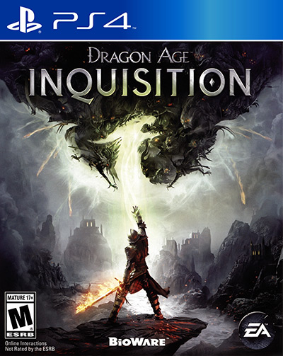
I believe a game’s box art should have an impact.
You should be able to see it from a mile away and tell it apart from all the other game covers at a store or an online marketplace.
Dragon Age: Inquisition accomplishes this by placing the large dragon logo front and center, while simultaneously having exactly zero dragons in the picture.
Look closer, and you’ll notice the dragon is nothing but empty space in a dramatic scene of demonic hordes descending from the fade as the Inquisitor reaches up into the rift, flaming sword in hand.
If that’s not art, I don’t know what is.
The dragon shape would return in the promotional art for every DA:I DLC, giving us a collection of fantastic art with the same fierce motif.
2. Shadow of the Colossus (Only On Playstation Edition / UK) (2018)
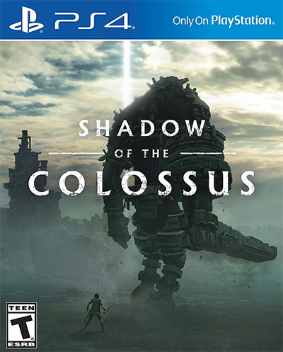
Not all region-exclusive box art comes from Japan.
In 2019, Sony released the Only On Playstation product range, including 10 exclusive hit titles, and gave them spiffy new cover art featuring bold colors and stylish design.
One of my favorites belongs to Shadow of the Colossus, which qualifies for the Only On Playstation line thanks to the exclusive remake it got back in 2018.
It’s striking but minimal – and that aquamarine color is just gorgeous.
1. Bloodborne (Only On Playstation Edition / UK) (2015)
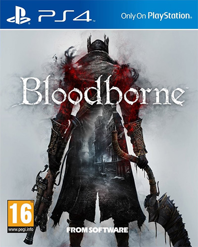
Bloodborne is one of the PS4’s most coveted exclusives, and I’m sure it pushed more than a few of you out there to get Sony’s machine over an Xbox One.
For these achievements, Bloodborne gets celebrated with this delightfully simple cover belonging to the Only On Playstation line.
The peaceful white silhouettes and letters on a rich blue background create a stark contrast with the grizzly trick weapon that is the Saw Cleaver.
Bloodborne’s original box art isn’t bad – but this cover art is just as polished as Bloodborne itself.
