25 Worst (and Laziest) Pokémon Designs Of All Time
This post may contain affiliate links. If you buy something we may get a small commission at no extra cost to you. (Learn more).
I’m not an overly negative person. Especially when it comes to Pokémon.
I love monsters of all shapes and sizes.
But some of them really need to take a long hard look in the mirror.
For me, bad Pokémon designs instill some kinda genuine anger in me. I’m going to try and justify that anger with this ranking of the worst designed Pokémon of all-time.
25. Maractus
Okay, so Maractus isn’t exactly a bad looking Pokémon.
But the cactus design is beyond lazy, all things considered.
We’d already gotten a better-looking cactus Pokémon in Cacturne, who might I add captured all of our hearts in the anime.
There’s nothing wrong with using the same ideas for different Pokémon. But each one needs to be somewhat different from one another.
Maractus could very easily be a member of the Cacturne evolution line at-a-glance.
24. Kricketune
The idea of a cricket Pokémon has a lot of potential. But Kricketune is not that.
Despite actually having a really cool sounding cry, I just find the design completely uninspired.
It’s got a big handsome mustache, I’ll give it that. But that’s about it. The rest of the Pokémon is as boring as it comes, which is a real shame.
I’d love them to give Kricketune another evolution. But it’s long since been abandoned by Game Freak.
Maybe it’ll get some love in the Sinnoh remakes, but we’ll have to see.
23. Sudowoodo
Sudowoodo isn’t a fundamentally bad design.
But I hate this Pokémon with every fiber of my being.
It’s just one of those unexplainable rages. Have you ever met someone who’s face you just hate for whatever reason? That’s me and Sudowoodo.
There are quite a few examples of my unexplainable vain and unfair hatred for fictional monsters on this list, but Sudowoodo is the first example of it.
I’m putting pretty low here because I can understand if you actually like the design, but you’ll never see one of them on my team.
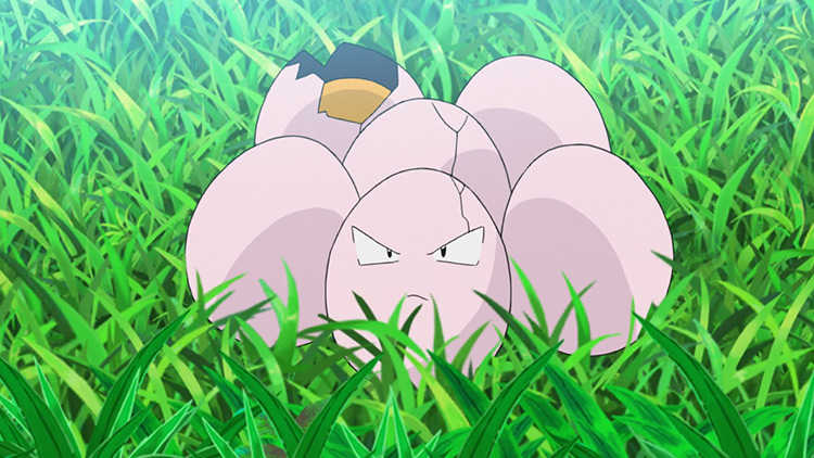
22. Exeggcute
It’s a box of eggs…. That’s it…
I’m actually pretty sure that I saw one of these guys while making breakfast this morning.
If you want to talk about bizarre real-life inspiration, this is the epitome of it.
Especially when you realize that it evolves into a palm tree for some unexplainable reason.
I could go into the kitchen and stick some googly eyes on a packet of eggs and have a real-life Exeggute of my own. If I can do that, then it’s not a well-designed Pokémon.
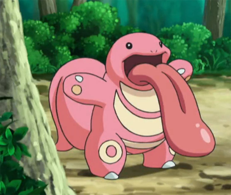
21. Lickitung
Lickitung is a serial offender.
It goes around licking living beings against its will, and that is really not okay.
As if that wasn’t bad enough, it looks like a big naked fleshy ball.
If you like Lickitung, as much as I might respect your opinion, you may have some serious issues to work out.
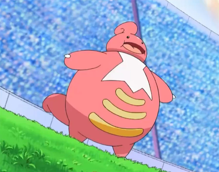
20. Lickilicky
Lickilicky is what happens when the police fail to apprehend a Lickitung, and it’s left to fester in its depravity for far too long.
It’s bigger, pinker, rounder, and has a perm-ish hairstyle that instantly puts Lickilicky on a watch list.
If you like Lickitung, then fair enough.
If you like Lickilicky, then there’s no hope for you whatsoever.
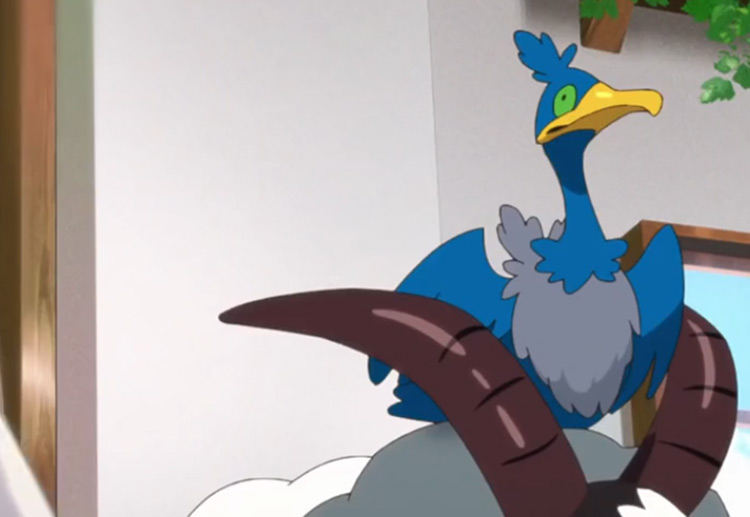
19. Cramorant
Entry number two in my unexplainable hatred saga.
This time starring Cramorant.
If you want to get technical, Cramorant is one of the worst bird-designed Pokémon I’ve ever seen.
Its weird flipper feet, its utterly pathetic tiny wings, and that unnerving stare are all enough to make me gag in disgust every time I come across one of these.
It has this holier than thou look about it that makes me want to punch it.And I really mean punch it.
If Pokémon was real, it would be me battling one of these things myself.
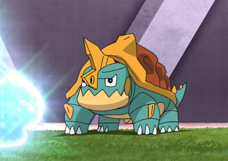
18. Drednaw
Drednaw is dollar store Blastoise.
It’s got the exact same color palette, and that’s not a coincidence.
Not even touching on the fact that it’s uninspired, but it’s just so ugly looking. I know I’m not one to talk, but god damn.
It’s so rough around the edges and has a boxy head that doesn’t fit with the design at all. I don’t know whose idea Drednaw was, but let’s leave that one where it is going forward.
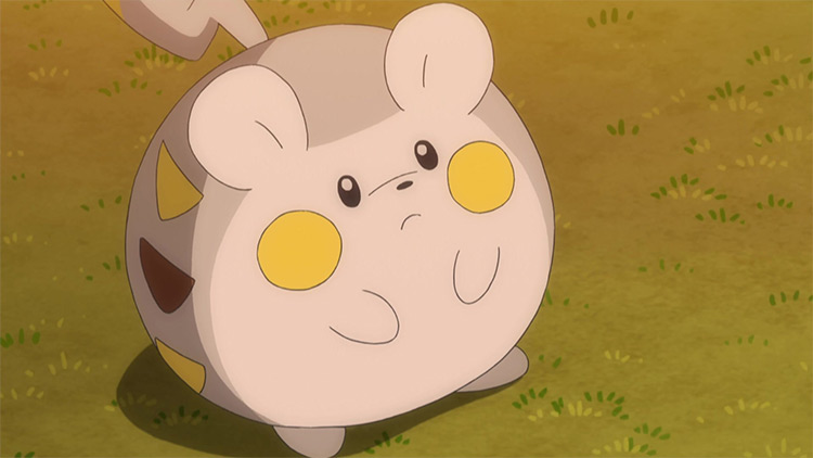
17. Togedemaru
Pachirisu is the gold standard of Pikachu clones for me.
Compared to Pachirisu, Togedemaru is the type of Pokémon that I would lay mouse traps out for.
It tries to be cute.
But every time I look at it, I get a sudden urge to kick it. It looks like a ball, and that’s all it has going for it. It’s an electric ball.
And Electrode already has that title.
16. Gumshoos
Gumshoos is the victim of timing.
I would love to love the design. How it looks like some evil villain plotting world domination.
But it’s just a Linoone reskin.
Shape, color, inspiration, all of it is the same.
Gumshoos looks like an alternative evolution of Linoone. And if that isn’t lazy, then I don’t know what is.
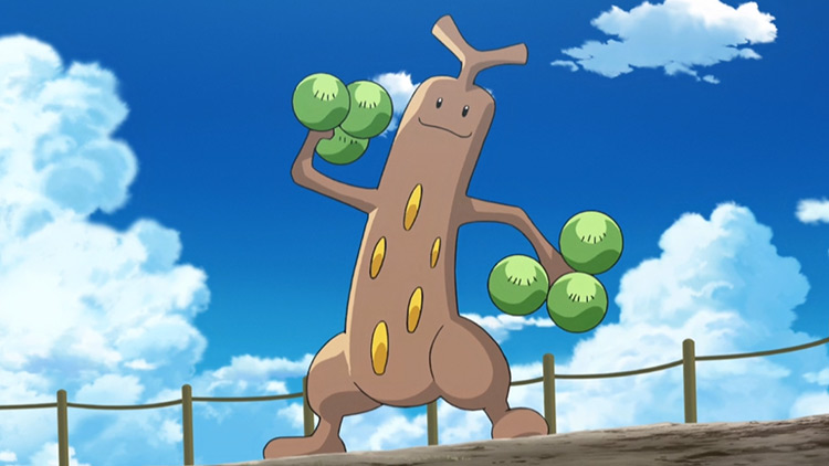
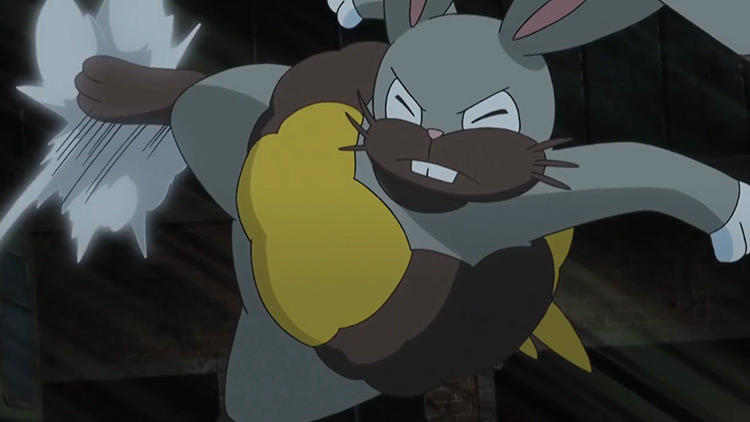
15. Diggersby
Diggersby looks like me when I let myself go that one summer.
I mean, it’s slob personified. Which isn’t exactly what I’m looking for when putting together a team.
It’s packing a few two extra pounds, looks like it hasn’t showered in a month, and has the most horrible looking beard I’ve ever seen on a Pokémon.
Kricketune would be ashamed.
I can practically smell it through the screen. Although, that might just be me… Still, though, it’s a horrible design.
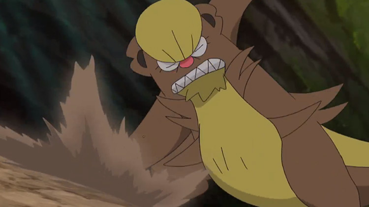
14. Watchog
What happens when you mix a copious amount of drugs with a meerkat?
You get Watchog.
Aside from the fact that it was the new age Raticate, Watchog was a misery every time I had to face one.
Not only is it a far cry away from being anywhere similar to a meerkat, but just look at those eyes, man!
Like how much acid and speed do you have to drop to get red eyes with a massive yellow stripe running through it? And why is it always so angry?
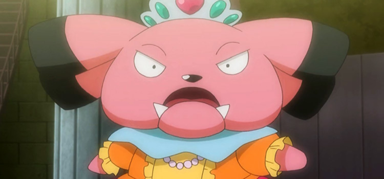
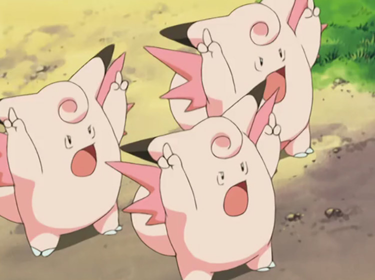
13. Clefable
Boring. That’s the only word I could use to describe Clefable.
I don’t know what it is about pink Pokémon that drives me to such loathsome depths.
I honestly like the color, but the Pokémon sporting it are all just so… wrong.
Clefable is a bore to look at. For a Pokémon that supposedly came from the moon, you would really wish that Gamefreak put a little more effort in here.
What, it’s got some wings? A curly tail? Ears? Legs?
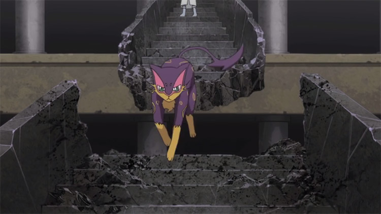
12. Liepard
Liepard is probably one of the most controversial entries on this list.
If you get Liepard, I get it.
However, I’m not a fan at all.
My reasoning here is quite simple; it looks like a cat Skuntank, who ironically doesn’t appear on the list.
It’s also got the downside of being one of the route one mon’s, and the bar is actually quite high here, in my opinion.
If you like Liepard, that’s okay.
But it just seems uninspired to me. I don’t know; it’s my list.
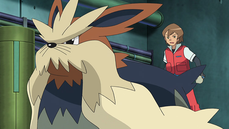
11. Stoutland
On the other side of the Unova route one Pokémon, we have Stoutland.
Gen V was lambasted for its poor Pokémon designs, and I feel like these two are the most prime examples of that.
I thought Liepard was uninspired. I think Stoutland is lazy.
It’s a giant brick of a dig with some sort of massive mustache thing. Kricketune is an example of how to do a mustache right; this is not.
I’m not sure if it’s supposed to be based on Churchill or something, but it falls short of whatever misguided goal it’s trying to achieve.
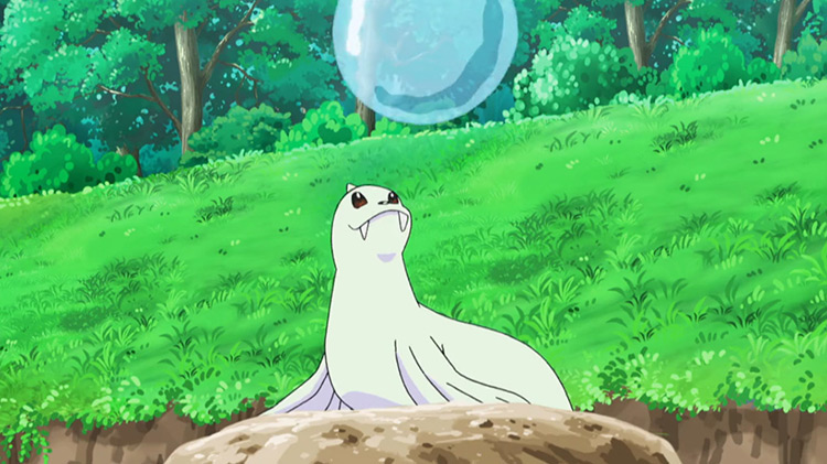
10. Dewgong
Sea lion. It’s a sea lion.
No, literally, it’s a sea lion.
Game Freak copy and pasted a real animal into the game. There’s almost no difference whatsoever.
Sea lions are cute, and so is Dewgong.
But when you’re literally going to ctrl-c / ctrl-v an actual animal into the game, I can’t describe it as anything other than lazy. It’s only lazy, though, not ugly…
So I’ll compromise and try to keep it low enough on the list.
9. Bibarel
I love Bibarel! But God, is it ugly.
The Pokémon is very much a god among mortals, a man among boys.
But it has this look on its face that fills me with longing for what could have been.
It looks like it’s just happy to be there, and that’s fine. But there’s something about those beaver bucktooth teeth that just fills me with anguish (no offense if you have a bucktooth yourself, there’s no doubt that you rock it better than Bibarel does).
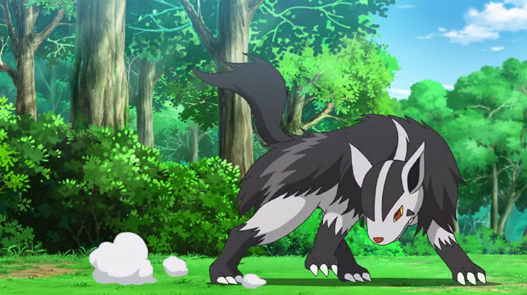
8. Mightyena
Again! This Pokémon design is just so boring.
There’s nothing going on here.
It’s not even like Mightyena is a normal type; it’s dark, for crying out loud. Give it some shadowy features instead of just giving it some black fur.
I mean, look at Luxray. Its design is similar to Mightyena, but it’s incomparably better because it actually has some personality to it.
Mightyena is what happens when you don’t grow out of your emo phase, and that’s just really sad.
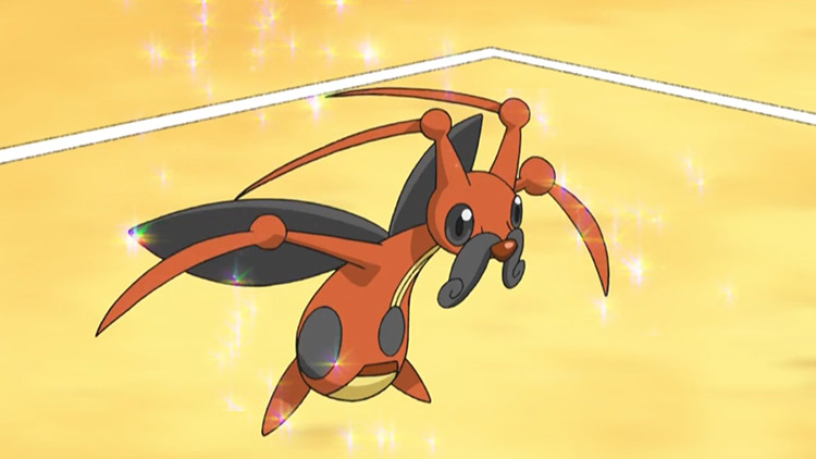
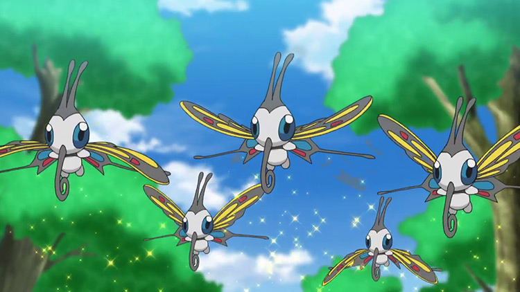
7. Beautifly
If there’s going to be an entry on this list that you disagree with, it’s going to be this one, and that’s fine.
I’m honestly not even convinced it deserves this spot myself.
It’s a fine-looking Pokémon. Pretty, in fact. However, it just reminds me of Butterfree too much.
And when I’m reminded of Butterfree, I get really sad (we all know what episode I’m talking about).
I don’t like being miserable when I play Pokémon. So Beautifly’s design is horrible, in my opinion.
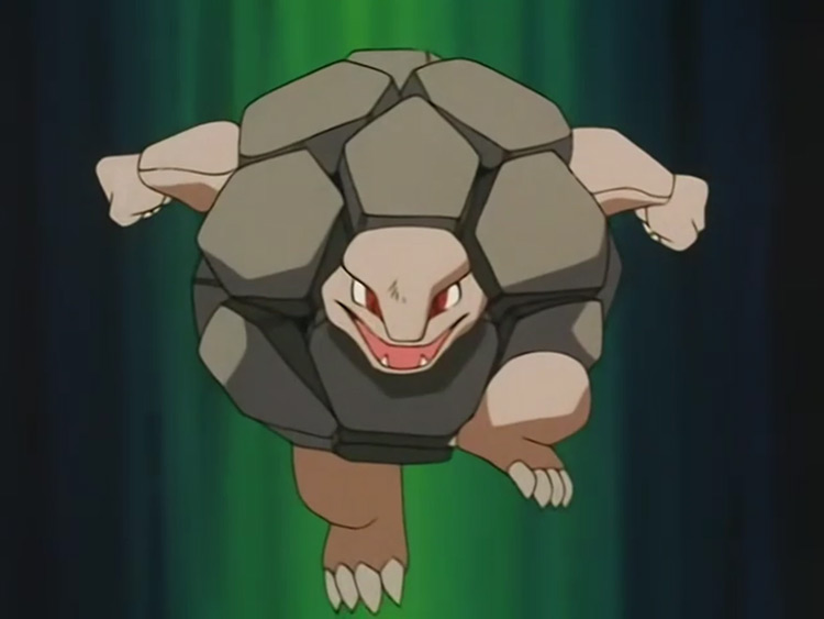
6. Golem
Is that a boulder? Or a big rock? (if you’re one of the three people that will get that TaskMaster reference, then I genuinely might be in love with you).
In all seriousness, Golem is exactly that: a big rock.
Sorry, it’s a big rock with a head randomly sticking out of it.
Geodude already lacked in the design department, but this is just pathetic.
Considering the hoops you need to jump through to even get your hands on one in the first place; Golem is more than deserving of being considered among the worst Pokémon designs ever designed.
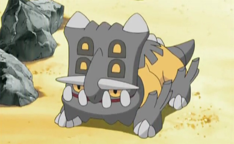
5. Bastiodon
U. G. L. Y.
I’ve never owned a Bastiodon, and I never want to.
I honestly feel a little bit better about myself every time I look at one. And that’s definitely not a good thing.
I mean, who decided that this design was okay? It’s got this horrible, cramped head, teeth to make Rob Beckett blush, and a boxed off chin that makes Bastiodon utterly loathsome.
That’s not to mention the fact that it has a five-head that would make my little sister’s look small.
There’s nothing more I have to add here; it’s just really ugly.
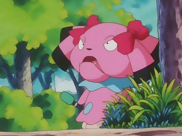
4. Snubbull
We’ve all seen a brutish looking little girl that’s dressed up all frilly with a little pink bow in her hair, but is actually a horrible looking child (as mean as that is to say).
Snubbull is that character personified.
I hate ugly kids, so a Pokémon based on an ugly head is naturally going to draw my ire.
Plus, have you seen the Pokémon movie?
If you didn’t think that Snubbull was a playground bully that’s coddled by its parents before that movie, then you certainly will after you see the film.
That’s also the film where Ash straight-up attempts to knock out Mewtwo. So do yourself a favor and watch the film, come back here, and tell me how right I am in my Snubbull assessment.
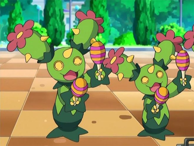
3. The Simis
Simipour, in particular, is the mon’ that I have in mind for this number three spot. But all of them are well deserving of being at the number three spot.
These designs are almost universally hated by the Pokémon community. And it’s not hard to see why.
Simisage is the best looking of the bunch.
It probably shouldn’t be on this list, but just like real life, the actions and appearance of its siblings are dragging it down.
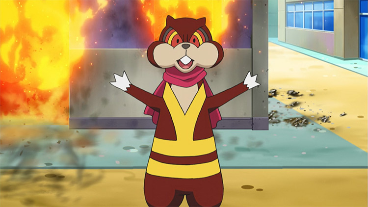
Simisear is much worse. It looks like it’s just been ushered out the door for its school photo after being told how handsome he is by his mother. I mean, I have curly hair, and I’m no looker myself, but whatever is going on with Simisear is questionable at best.
We’re not even going to talk about whatever way Simisear walks around with its arms akimbo, because I honestly might get canceled for my brutality.
Simipour is the worst of the bunch by a country mile, though. If the trio were real, Simipour would be the hippie sibling drop out of the bunch, but the drop out still living at home at 29.
Its dress is far too revealing for a Pokémon to be wearing. Seriously Game Freak, this is a children’s game! Its hair is also just revolting.
These Pokémon are meant to be based on monkeys, but I don’t see it at all.
I’ve been fairly explanatory with my dislike for these three here, but if you need further convincing, I’ll write you an itemized essay on the topic.
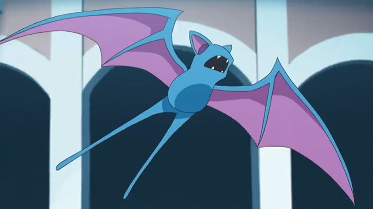
2. Zubat
Is this entry biased? Yes.
Is it wrong that I’m letting my bias dictate the number two spot? Also yes.
Aside from how utterly infuriating it was to deal with these back in the OG generations, Zubat has a design that’s so uninspired you could conceptualize it in an hour.
")

")


 Naruto Video Games Ever Released, Ranked")
