This post may contain affiliate links. If you buy something we may get a small commission at no extra cost to you. (Learn more).
The Sega Genesis – which some of you know as the Mega Drive – was one of SEGA’s most famous consoles and their horse in the race for console supremacy against the Super Nintendo.
The war was waged on all fronts, with video game box arts being where SEGA dominated.
Ask anyone who was there at the time, and they’ll tell you SEGA’s covers were more realistic and mature. They make games look bad-ass, which helped them reach out to older audiences.
Now that the “war” is over, we’re left with the spoils: a catalog of games with fantastic box art we’d all want to display in our collections.
Let’s take a look at the very best.
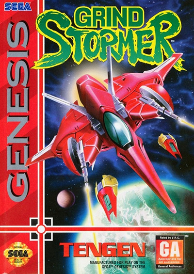
25. Grind Stormer (1993)
Grind Stormer is a fantastic vertical shooter by some of the business’s best minds, which regrettably didn’t have the commercial success it deserved.
What I love the most about this cover art is how the artist nailed the perspective. It feels as if the ship is about to pop out of the box.
Of course, the ship’s design itself is also top-notch. Especially those guns!
The artist also made sure to include the two small drones that follow you around in-game, which is a nice touch.
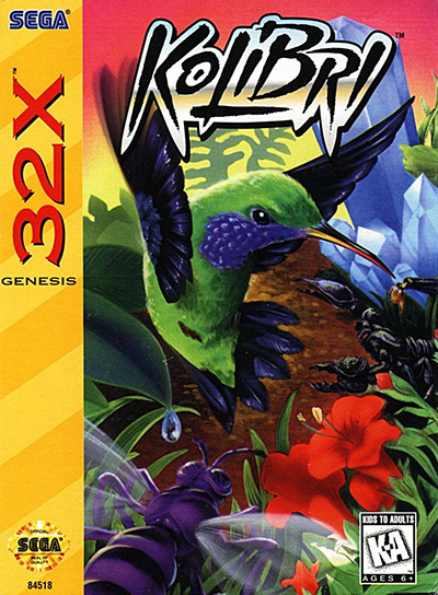
24. Kolibri (1995)
In the 2020s, most parents have given up on policing what their children consume on their consoles – but back in the 90s, it was serious business.
Kolibri is an example of a game dev studio using its creativity to bypass parents and deliver excellent gaming experiences to young gamers.
The game’s box art tries to transmit the dynamism and action-focused gameplay through its cool font and angry-looking hummingbird while still appeasing parents with its bright scenery.
This is the perfect game to introduce your eight-year-old to old-school side-scrolling shooters.
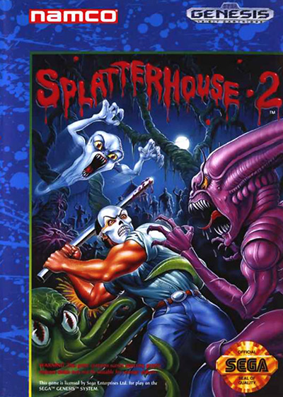
23. Splatterhouse 2 (1992)
Splatterhouse 2’s cover art looks like a horror movie poster – except there are no victims.
The Terror Mask makes protagonist Rick look like Jason from Friday the 13th. Watching him fight a bootleg Xenomorph and a sharp-teethed ghost feels more like a monster battle royale than a hero struggling for survival.
Despite being such a violent scene, it retains a certain cartoonish goofiness that reminds me of B-movie posters.
It’s a colorful blast from the past.
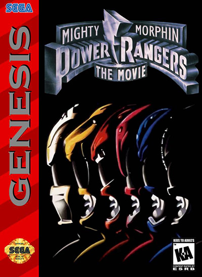
22. Mighty Morphin’ Power Rangers: The Movie
The Mighty Morphin’ Power Rangers beat-em-ups were pretty popular back in the day, and the Genesis version of MMPR: The Movie is the best of the bunch – especially compared to the SNES release.
It also has much better box art.
Whereas the SNES version features the movie’s logo and a real-life picture of the White Ranger, this one went with an exciting composition with every ranger’s profile.
The Power Rangers are all about teamwork, and everyone has their favorite. Including them all was the smart move – plus, the dramatic effect it achieves makes you feel like you’re in for something epic.
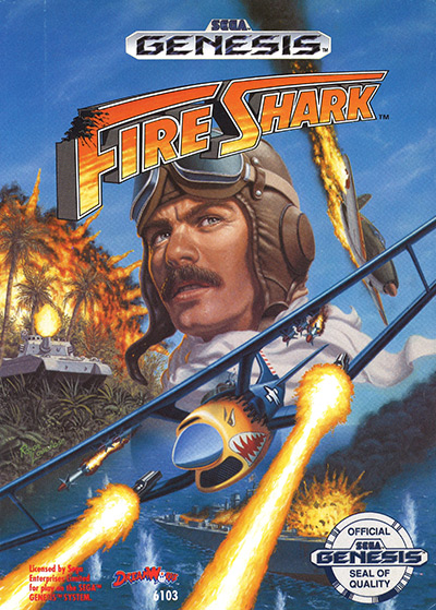
21. Fire Shark (1990)
It might sound like an early version of Shark Boy & Lava Girl, but Fire Shark is a solid vertical-scrolling shooter first released in arcades.
You could describe the game as a WWII-based shoot-em-up, though it doesn’t actually take place in this dark period in history – it’s just remarkably similar in looks and technology.
The cover art is, at the same time, accurate and misleading.
On one side you see the player plane spitting fire and a ton of enemy aircraft in the background, but there’s also a giant shark figure in the back.
It’s meant to transmit the idea that the player is the “flying shark,” but I’d have been disappointed at the lack of actual giant airborne sharks.
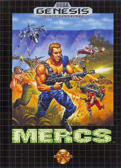
20. MERCS (1991)
I know what I’m looking for when hunting for an old-school run-and-gun.
There have to be manly men, explosions, and as much gunpowder and lead as the system will allow.
The cover art for MERCS advertises just that.
Everyone in the cover is ‘roided up, they all carry machine-guns, and they all have the balls to go up against tanks, helicopters, and fighter jets by themselves.
It’s bad-ass, and that’s enough for me to want to buy it.
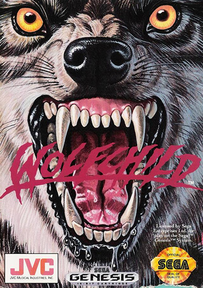
19. Wolfchild (1992)
Next up, we have Wolfchild, a great action platformer where the main character can become a werewolf once enough energy is collected.
Judging by the cover art alone, you’d be forgiven for thinking you’d play as a wolf the entire game. Not even a werewolf – just a regular wolf.
I have to admit the intense aggression in the animal’s face is very attractive. Its stare is sharp, its fangs sharper, and the slight drool on its lower lip makes one think of animalistic savagery.
If you were at the store looking for a violent game, you’d have bought this for sure.
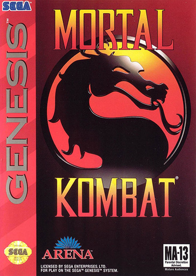
18. Mortal Kombat (1993)
What can I say?
You can’t beat the classics.
Making cover art recognizable is critical, especially when games have to be bought at the store rather than online.
This simple design with strong, contrasting colors became a symbol of violent gaming in general. There are many people with the MK dragon seal tattooed on their bodies, and even I own some gamer décor depicting this iconic logo.
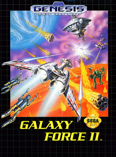
17. Galaxy Force II (1988)
Galaxy Force II sets itself apart from earlier rail shooters through Sega’s “super scaler” technology, which allowed them to more accurately represent depth by dynamically scaling the game’s sprites and backgrounds.
As such, it was important for the box art to showcase perspective and depth.
We can see many elements like robots and spaceships flying toward what looks like a mothership over a field of lava.
Many items were represented as being at varying distances from the viewer in a bid to emulate the game’s pseudo-3D look.
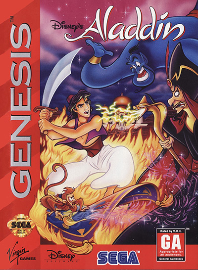
16. Disney’s Aladdin (1992)
Tie-in games have a terrible rep for fair reasons.
But Disney really hit it out of the park with Aladdin on the Genesis.
Not only is the gameplay solid, but the sprites and backgrounds are gorgeous. It looks just like the movie!
The box art is also a work of genius. The colors are intense, and it includes all the major characters in the game.
Going with an action-packed scene of Aladdin swinging his scimitar against Jafar reflects the gameplay pretty well, and it’d get anyone excited to get home and start cutting down some bad guys.
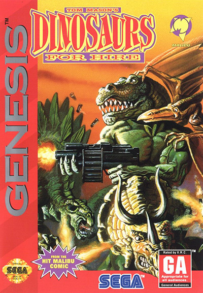
15. Tom Mason’s Dinosaurs for Hire (1993)
You have to appreciate the unapologetic craziness of this cover.
Nowadays, people want boxes that look cool and make sense.
Back in the day expectations weren’t so strict.
You just wanted something fun and flashy.
Muscular, weapon-wielding dinosaurs did the trick.
The game is based on a classic American comic book series from 1988, so we can’t blame the game developers for this ludicrous setting. Still, the hyper-masculinity of the cover was typical of this era in gaming, and we probably won’t see anything quite like this again.
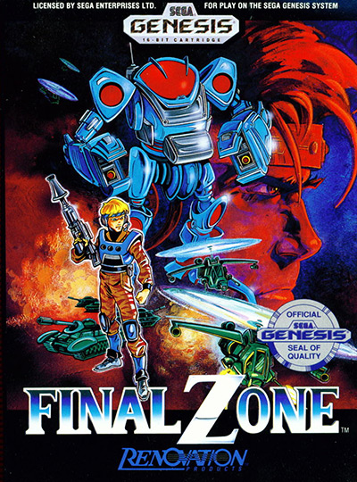
14. Final Zone (1990)
Final Zone is a unique isometric shooter taking place 100 years into the future at a time when humanity’s wars are fought with awesome mechs known as New Age Power Suits.
The cover features a NAPS front and center, depicted in contrasting steely blue and deep crimson colors.
While it definitely isn’t the exact cover used for the original Japanese launch, it does retain a somewhat Eastern aesthetic – though I feel the tanks and helicopters were added to tone that down.
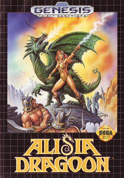
13. Alisia Dragoon (1992)
The fantasy genre has grown a lot over the years, but some things never change.
One of them is dragons.
The scaly beasts have become synonymous with the genre, but somehow, we don’t seem to grow tired of them. Zombies are a fad, vampires are a fad, and wizards are a fad – but dragons? You gotta have them!
Alisia Dragoon’s cover mixes our love of fire-breathing dragons with our appreciation for well-toned bodies, seen on the heroine and her enemies as well.
Why is everyone so buff in these covers?
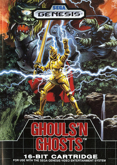
12. Ghouls’ n Ghosts (1989)
Instead of just going for Ghosts’ n Goblins 2, Capcom decided to market the sequel to the iconic action platformer as something new – Ghouls’ n Goblins.
I’m not a fan of their marketing logic.
But it helped Capcom set the game apart from its predecessor and market to a more mature audience.
The game’s box art for the Sega Genesis version follows this logic, replacing the cartoony style of the original with a more realistic, badass scene of a golden-clad knight with a large lance ready to slay the headless demon that looms over him.
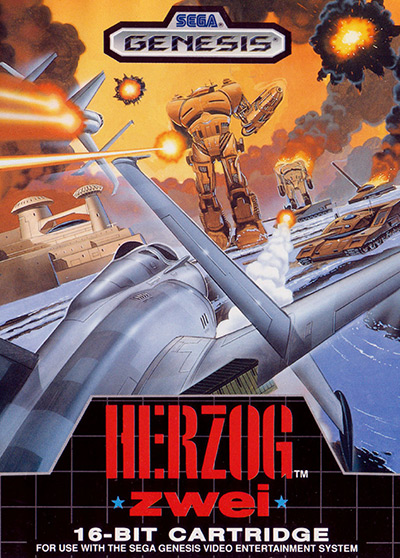
11. Herzog Zwei (1990)
Fans of MOBA games like League of Legends or Smite would do well to pay respects to Herzog Zwei, one of the earliest real-time strategy titles.
While the box art does nothing to let you know the game is an RTS rather than a shoot-em-up like every other game with a plane on the cover at the time, it does accurately represent many elements present in the game such as the fighter jets, giant mechas, tanks, and more.
The artist’s mastery of perspective is exquisite. And the scene of jet fighters, ground-based forces, and colossal robots shooting it out couldn’t be more exciting.
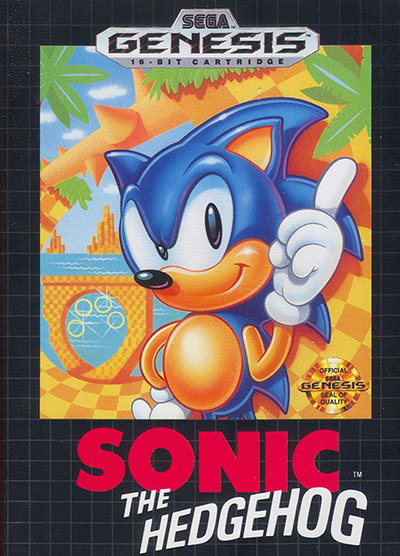
10. Sonic the Hedgehog (1991)
The first game in the Sonic the Hedgehog franchise needed to make a splash so the mascot would stick, and the cover art was the first step in the long journey towards brand recognition.
Sonic’s design is rounded, so it appeals to kids. The composition is also very colorful, and Sonic’s finger-wagging pose has a certain 90s bravado that seems to say, “I’m a super-fast hedgehog. Get on my level”.
It’s certainly not as exciting and dynamic as the game itself. But it was recognizable, and most of us remember it fondly.
I also love that they included a 360 loop in the background – as if anyone could understand what it was before playing through Green Hill Zone.
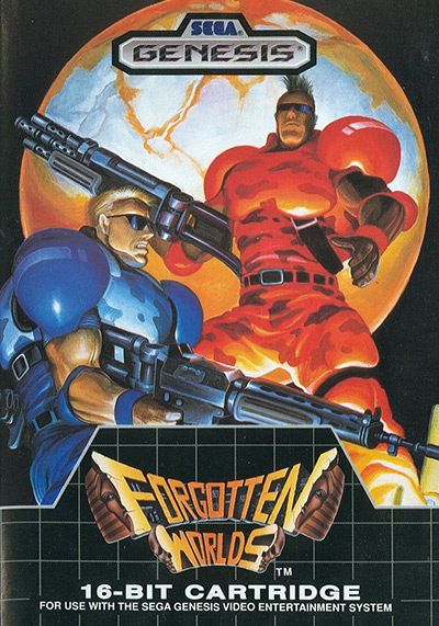
9. Forgotten Worlds (1988)
Why didn’t anybody tell me Destiny was based on an 80s side-scrolling shooter?
Jokes aside, I can’t help but notice a striking similarity with the aesthetic of this box and my favorite looter-shooter. These two cool space marines look surprisingly like Guardians, and the giant planet behind them might as well be the Traveler.
Aesthetics were what first drew me to Destiny, and they’re pulling me to play this game right now.
You just can’t go wrong with two beefcakes with big guns and even bigger biceps. The sunglasses are a nice touch that somehow assures me they’ll be able to take on whatever the game throws at them… if I don’t suck at the controls.
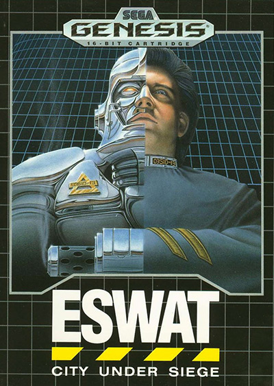
8. ESWAT: City Under Siege (1990)
Before the advent of 3D graphics and special effects, things had to be done the hard way.
If you wanted a crazy sci-fi cover that looked realistic, you couldn’t just make 3D models – you had to hire an artist with a detailed, photorealistic art style and have them draw your wildest fantasies.
This created a unique look shared by many old-school movie and video game art, and you can see it in full display on ESWAT’s cover.
It’s very dramatic and intensely appealing.
It’s the kind of thing you feel proud of displaying in your collection, and it’ll transport you to the early 90s immediately.
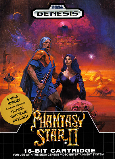
7. Phantasy Star II (1989)
The Phantasy Star JRPG series has plenty of awesome covers under its belt.
And the second game in the series is the cream of the crop (at least among Western releases).
Not only is the art style gorgeous, but the scene sells you a space opera adventure the likes of which you’ve never seen before. There are futuristic weapons, bizarre insect-like alien critters, and a city overlooked by what looks like a giant eye lies in the distance.
The 6 Megabyte Memory sticker is also a big win.
It was the first game with such an advanced cartridge, and it promised a very extensive adventure – which it delivered. There was also a 110-page guide, which was a godsend back when the Internet wasn’t there to help you out.
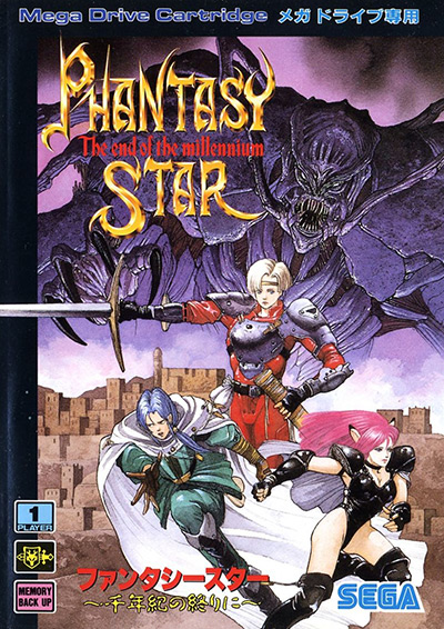
6. Phantasy Star IV: The End of the Millennium (JP) (1993)
When it comes to JRPG box art, the Japanese have a home advantage.
And they don’t have to worry about “Westernizing” their covers.
The result is gorgeous scenes in the style of classic anime and manga from the 80s and 90s.
Phantasy Star IV is a prime example.
The unapologetically Japanese art style allows for much detail, and it shines when it comes to machinery like the robot arm on the dangerously scantily-clad pink-haired lady on the back of the box.
I also love the look of the giant alien demon lord looming over the heroes on the front. It’s bad-ass in a way most Western illustrations just didn’t achieve at the time.
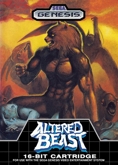
5. Altered Beast (1988)
Altered Beast was a pack-in game for the Sega Genesis – and it was a fantastic way to start your gaming journey on Sega’s latest console.
From the moment you lay eyes on the cover, you know you’re in for a wild (and violent) ride.
It introduces you to many of the beasts you’ll be fighting or playing as in this beat-em-up and sets a dark ambiance with its color palette.
It also makes sure you know that despite the many scary beasts, your character is a jacked werewolf who can bring them all to heel. Selling the power fantasy is vital in a beat-em-up.
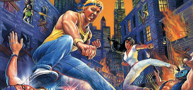
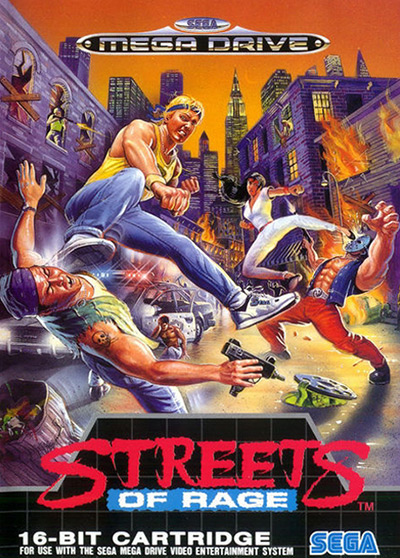
4. Streets of Rage (Mega Drive) (1991)
I’m definitely not taking the quality of these games into account for this ranking. But a lot of the best Genesis titles have amazing cover art.
Well, in this case, I’d have to call it a Mega Drive title.
The cover for widely-acclaimed beat-em-up Streets of Rage is pretty good on the NA release, but the European version is on another level.
It’s a lot more dynamic and just plain cool. It showcases some of the fighting moves you’ll use in-game, and I find the green man looking out from under the manhole hilarious.
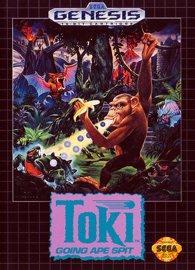
3. Toki: Going Ape Spit (1992)
I love Toki.
The game is an exercise in unbound creativity. The setting is absurd, the main character’s powers are bizarre, and it all just feels like a fever dream from beginning to end.
This can be inferred from the cover, which depicts magic monkey-man Toki doing what he does best: spitting out energy balls from his mouth at the local wildlife.
Looking at the cover, you’d be forgiven for thinking Toki is actually the bad guy. I mean, his facial expression isn’t that of a hero…
Still, you’d also be pretty bloodthirsty if someone kidnapped your bride-to-be.
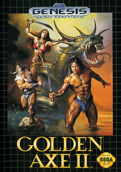
2. Golden Axe II (1991)
As we’ve already discussed, everyone was totally jacked in the early 90s – at least in video games.
And Golden Axe II made its characters’ muscles the main feature of its cover art.
It’s advertising a power fantasy for anyone who plays it.
There’s a massive, hyper-muscular barbarian wearing a loincloth that barely covers his nether regions, a similarly scantily-clad Viking with just as much muscle mass, and a super-hot super-fit Amazoness unapologetically wearing a modern bikini while riding a dinosaur.
It makes no sense.
But nobody really cares.
We’re here to feel powerful as we beat up hordes of evil minions.
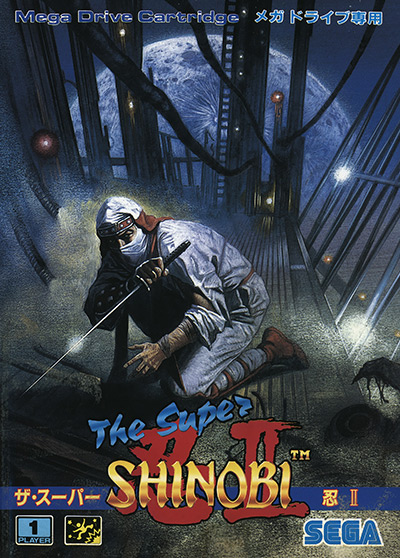
1. The Super Shinobi II (JP) (1993)
Known in the US as Shinobi III: Return of the Ninja Master, this incredible hack-and-slash platformer has my single favorite cover art in the entire Genesis archive.
While the US release has an acceptable Western-styled cover depicting ninja and samurai wielding their weapons of choice, it doesn’t have a tenth of the impact of the Japanese one.
Rather than just standing around with a sword, we see the shinobi in the middle of battle.
He’s probably hurt, and his clothes are torn up, but he stands his ground against a dark figure we can only catch a glimpse of in the lower edges of the frame.
What catapults this cover to the top (other than the incredible) detail is the gigantic moon in the back.
It adds a ton of drama and contrast to the dark scenery, and it’s just plain beautiful.
Nelson Chitty is a Venezuelan expat living in Argentina. He’s a writer and translator passionate about history and foreign cultures. His ideal weekend is spent between leisurely playing games of Civilization VI and looking for the next seinen anime to marathon.


")


")
